Friday, January 4, 2013

Art of the Tattoo

Blood Bound © 2012 SRB Productions, Inc
My recent cover for SalGad Publishing’s book titled Blood Bound has been selected for the Art of the Tattoo gallery show. It opens tonight to the public and starts at 7:00 PM. This show features artwork and photos showcasing the art & beauty of the tattoo. Since the show is focusing on the human form, please note that there will be some tasteful nudity in this show.

Join us for snacks and refreshments, & show off your tattoos! 

Details with the address are HERE

Monday, December 24, 2012

3rd Sight - A Horror Novel


With the new release of Ian Woodhead's Third Sight, I reflected on the illustration and thought it would be the ideal instance to take a step back to discuss the progression for this gruesome and wonderful work of fiction.

Third Sight © 2012 SRB Productions, Inc

Please forgive the indistinguishable explanation supplied of the story. I wish not to give away any plot points. When I was approached with this venture, a depiction was given and the opening concepts instantly popped in my psyche. The story is about Adrian Winters who is unaware that a newborn demon has chosen him to be its watcher. The demon shows itself more as a demonic clown that a traditional “Devil”, and the editor-in-chief and author were very firm with that end. Keeping away from the usual suggestion of a evil spirit was # 1 on my register of things not to do. They also required having a sense of anonymity, not illuminating any large narrative points that one could not gather from the backside cover abridgment. With these boundaries, I fashioned the subsequent sketches. 

 
Sketch #1 © 2012 SRB Productions, Inc.
In Sketch #1 we have a close-up of our evil spirit friend gazing sinisterly. It is zoomed in a sufficient amount for the focal point to be the eye. This is in reference to the “Sight” of the title. One thing I wanted to show was a smirk, not a full smile. Personally I find a smirk creepier than a full on toothy grin.

Sketch #2 © 2012 SRB Productions, Inc.
In Sketch #2 we have something that is hard to demonstrate in a draft; nevertheless we have our mischievous sprite holding up a shattered frame with our central character in it. With this we can demonstrate our demon’s hands, our hero being a kind of every man, and a fractured likeness of our fiend anywhere with bits and piece of glass.

From here they sought to go with the more conceptual and less customary illustration in Sketch #2. So my next stride was to take some location shots and start to draw out the comprehensive. 


Third Sight © 2012 SRB Productions, Inc.
In entirety, the drawing took approximately 2 hours to have the lot setup just right. Beginner artists tend to rush this process when painting, but I have discovered most of problems are fixed with a well rendered composition.

It may be a peculiar fondness but I like to go in with a strategy. Even if conscripting the strategy can be lengthier than the authentic painting procedure, it is time well utilized as everything going into the piece has been taken into account. From here my cognizance can be elsewhere and the painting just because something natural and fluent to my body’s movements. I no longer have tensed sensation about shadows or light location, it has already been understood in boundless detail and my stylus flows gracefully over the screen.

Once the comprehensive is set, I paint the whole shebang in black and white via Corel Painter. I make sure to use only three layers. The highest layer is continuously my comprehensive drawing set to multiply as this allows us to see the drawing while painting.  The second layer is pure whites and below that layer are my solid blacks. This produces my "frame" for the painting and makes it much easier to emphasis on the particulars. If I have already established the bottom corner, which will be complete black, I no longer have to burden with it and almost 15% of the painting is complete. 

Third Sight © 2012 SRB Productions, Inc
An additional article to remain in thoughts is where your text placement will go. Even back in my preliminary sketches I threw in some copy as a thought of where there will be negative space. Countless covers are excessively hectic for the sack of building a vigorous picture. While a stand alone piece of fine art is stunning, cover artist must take into account the title and the author’s name. So I continued to build tone until I am happy with the overall look. The way I establish my satisfaction is based on the completed nature of the piece. If it looks like a stand alone Black and White image, then I know I can move forward. 

From this end I begin establishing color and blending it into the mix. I will not go  into particulars on how colors are added as I am in the process of writing a novel depicting this in incredible detail. Also, I will be teaching this precise method of digital painting in forthcoming painting lessons for Art Jam Studios. I will incorporate a link at the foot of this post.

Once all my colored is applied we have the completed cover. Then the designer, which also happened to be myself for this piece, positioned every piece of text and fashioned this announcement. I adore how this illustration came as one and it is, without a doubt, one of my favorites. I hope you enjoy this quick glimpse into my thought process please support the book by buying yourself a copy. 

3rd Sight – A Horror Novel

Third Sight © 2012 SRB Productions, Inc

If you would like to ask a more exact inquiry about this piece, please feel free to leave me a message in the comment section. 

Please be sure to Like us on Facebook, share with friends and all information for the upcoming Art Jam Studios Classes can be found here: Art Jam Studios - School of Art 

Stephen Bryant is Owner and Lead Artist at SRB Productions, Inc., Art Director at SalGad Publishing Group Ltd and Founder of Art Jam Studios, Inc. If you would like ask Stephen a question, please feel free to contact him at: stephenbryant@srbproductions.net


Wednesday, December 19, 2012

Art Jam!


I wanted to let everyone know who follows this blog to come and see more of my work and some critiques over at Art Jam Studios –School of Art. They will be having online classes and live critiques that let you into the secret world of award-winning professional comic, cover and graphic design artists. You will the artists processes, watch them critique your work and take your love for art to the next stage. 

I have been graced with being an instructor and the online art classes available soon. They also have a monthly free portfolio workshop that is open to the public to submit work so please stop by and follow to beef up your portfolio.

Tuesday, December 18, 2012

Fallen Angels

I usually do not make political statements on this page, but the tragedy in Connecticut struck a chord in me. As anyone who personally knows me will attest too, I have a soft spot for children. Now I will not go on a rant on the political o
r mental instabilities of the matter, but the circumstance remains that 20 innocent children lost their lives. I want to give my deepest and sincerest condolence to the parents, the teachers and anyone who this affair has caused grief.

Please be aware that this illustration is not to degrade or minimize the tragedy that took place. Fantasy is simply my way of expressing myself and no disrespect is intended. Please feel free to share, like or leave a comment.

Sunday, November 11, 2012

Monster Madness Series


Hi Guys. 

This past October I did a Monster Madness series of some of my favorite Horror movie Icons. Hope you all have a chance to take a look and enjoy. 

I plan on doing more series of paintings soon so please be sure to check out the website regularly. 


Monday, November 5, 2012

How do you do that!?

Today I was asked by a fan named Valencia how I setup and use certain programs when it comes to my artwork, designs and also comics. Well Valencia, there are multiple programs I utilize in my work. First we will talk strictly digital painting. The are two programs I use in the painting process are Adobe Photoshop CS5 and Corel Painter 12.


 Both of these programs have their benefits and weaknesses. Adobe Photoshop is great for photo manipulation, adding some basic colors and setting up individual comic panels. Corel, on the other hand, has the innate ability to mimic other natural mediums such as oil, pastels and acrylics. Be warned though; if you do use Corel be sure to save often as it has the tendency to crash frequently. 


© 2012 "Evil Dead: Groovy" SRB Productions, Inc.
For what you are looking for I would try and stick with Photoshop. Just scan in your drawings, duplicate the first layer and set it to multiply. Then on the “Background Layer” double click it to make it its own layer, rename it (for this example I will call it “Background Layer”), erase all the black line and just start putting in colors. Now when you lay in color on the “Background Layer”, the inking will not be changed because it is above the layer in use and  will still show as a solid black line because you set it to multiply.

I start out all of my paintings with a good old traditional pencil or pen drawing. Then it is scanned in and setup for painting in a similar fashion as described above. I also leave the pen drawing on top until a solid black and white under painting is done. Then I use a color overlay to put down as a base coat. Once complete, I flatten the image and paint all my extra details right on the single layer. It is a lot to explain in a paragraph but that is the gist of it.


© 2012 "Sam" Salgad Publishing Group, LTC
As for your question about Graphic Design, I use the entire Adobe Suite but mostly Photoshop, Illustrator and In-Design. In-Design is the most universally used program for effective and efficient layouts. It allows you too easily do almost anything with type and your overall design wishes. If you can imagine it in your mind, you can probably do it in In-Design. As for Illustrator and Photoshop, I primarily use these when I want to create a custom font. Creating vectors is easier in Illustrator than the other programs and since they are all Adobe they can communicate with each other as long as you are using the correct file format. 
 
For more information on how I work digitally please visit the other step by step blog posts and be sure to following me on facebook: http://www.facebook.com/pages/SRB-Productions-Inc-The-Art-of-Stephen-Bryant/129671413743133

If you have any other questions please feel free to ask and I hope I helped in your journey to make your comic come to life. Please let me know how it is looking as I love to stay active in the comic community.

Monday, October 15, 2012

The auction is live!

The auction is live! Please check it out for some fantastic books, artwork, jewelry and more. It’s a good cause so dig deep for charity to support not only these generous artist, but also the kids fighting cancer. 


Saturday, October 13, 2012

Rick Majewski - Revisiting Poland Print Donation


 Today’s auction preview is donated by Richard Majewski.

From his 2011 show “Revisiting Poland”, we have a one of a kind print that is 11 x 17 and comes framed for your enjoyment. 


There are only 2 more days to get your donations in and pick which auctions to follow. I will post more auction previews today and over the weekend so stay tuned.

Friday, October 12, 2012

So many donations. So little room to write.


So many authors are digging deep to share, we have another fantastic book Sam and the Jungle Band, donated by DJ Corchin. This children's book will be autographed by the author himself has some really fantastic reviews out there. It is also illustrated by fellow donating artist Dan Dougherty.


This donation is so big it needs 3 separate links! We have several auctions consisting of 3 books donated by Grand Mal Press, that is 12 books all together! Simply amazing stories from almost every genre are on display. We have books from Nickolas Cook, Clifford Royal Johns, Craig Saunders,R Thomas Riley, Matthew Darst and so many more.


Wednesday, October 10, 2012

Rachel Renee Jewelry Donation


New auction page is live today. My beautiful wife, Rachel Bryant of Rachel Renee Jewelry has put up some of her custom jewelry. She will have a couple of auctions available, but today her Red Coral and Silver Earrings are accessible to preview.

Be sure to check out the auction page as 
                                                            it will go live in 5 days.


Monday, October 8, 2012

Iain Rob Wright and SalGad Auction Lot

Another donation today, this one is from famed author Iain Rob Wright of SalGad Publishing Group, Ltd  He has generously donated a signed copy of one of his best received works “Animal Kingdom”


Be sure to check out the auction as it will go live in 6 days.


My St. Jude's Donation

We have another auction up and ready to look at. It is my personal piece titled “Shaving a Pig” It was painted in gouache and is on 150 lb. Hot Press Illustration Board. 

Be sure to check out the auction page and click on that little like button to spread the word. 


The Donations Cometh!


The donations are starting to come in for Let the Kids Trick or Treat for Jude. Today’s listing is Rotten Volume Two Cover artwork by Dan Dougherty. The original artwork is11 x 17 completed using Higgins eternal ink on 120 lb Stonehenge archival paper. If you want to bid on this item the auction goes live next Monday so mark your calendars.  


Tuesday, October 2, 2012

Facebook event page up for Let the Kids Trick or Treat for St. Jude


We have a Facebook event page up for Let the Kids Trick or Treat for St. Jude. Be sure to stop by, RSVP for the event and ask any questions you may have. Hopefully we have a great turnout this year.

http://www.facebook.com/events/493934360630543/

Let the Kids Trick or Treat for St. Jude

Wednesday, September 26, 2012

Let the Kids Trick or Treat for St. Jude


Hi Guys,
I am not sure about everyone else, but my favorite holiday of the year is coming up. I am talking about Halloween of course. This year I wanted to do something a little different for all my fans and some smaller fans.

I will be auctioning off a one of a kind painting of one my favorite movie series “A Nightmare on Elm Street.” All proceeds will be donated to the St. Jude Children's Research Hospital. Not every kid gets to go trick or treating so I want to try and make it a Halloween to remember. If you would like to contribute, please let me know otherwise stay posted as the auction will go live this upcoming October. There is also a link at the top of the page just under my name.

http://www.stjude.org/stjude/v/index.jsp?vgnextoid=f87d4c2a71fca210VgnVCM1000001e0215acRCRD


Friday, September 21, 2012

Stephen Bryant: Illustrator, Graphic Designer...ART DIRECTOR?


Hello everyone,

It has been awhile since my last post. Big news for all the SRB lovers out there, I have been bestowed the honor of becoming the Art Director for SalGad Publishing Group. No doubt those that follow my face book/twitter have been wondering who SalGad is and what they represent. It is a fantastic company out of the UK that is taking a new approach to print. They are aware of the shift away from traditional print books and towards digital copies, making it easier for new authors to have their work seen by millions. I think they say it best “Well, firstly, we are a group of young and enthusiastic people that understand the current generation’s reliance upon technology and “social media”.  While older publishers are struggling to adapt their old ways and outdated methods, we are fully prepared for the digital revolution of the book industry.”

This past month they have released two novels, Sam and Sea Sick. Both are by Iain Rob Wright and available for purchase on amazon.com. Both images were created by me and I will do a step by step blog soon for Sea Sick as I forgot to take progress shots for Sam.


The terror continues. 


A new novel Vicious, seen below, should be out shortly as well. Be sure to check out SalGad's facebook page to get update regularly. We have some great stuff planned. 


So big things are coming out of SRB these days so be sure to keep your eyes open because we have more covers coming for SalGad Publishing, Grand Mal Press, Tumblar House and we have a new comic book coming with hotshot illustrator/writer Dan Dougherty and Rafael Nieves.


Tuesday, July 3, 2012

SRB PRINT SALE! One Day Only

Hi guys, I wanted to let everyone know that we will be having our annual 4th of July Print Sale. All 11 x 17 and 8.5 x 11 prints will be half off. be sure to check out the store and get your prints before time runs out. SRB Productions, Inc. Store: srbproductions.miiduu.com/digital-art

Monday, July 2, 2012

Sam by Iain Rob Wright

Last week I started work on Iain Rob Wright’s new novel Sam and will be doing the full design and artwork for the cover. This is a book based around exorcism/possession, and if you know me personally, you know that I love this stuff. Wish I could share more but its tight lipped at the moment. Be sure to stay on the look out for my updates and be sure to check out his other books at: http://iainrobwright.com/

Saturday, May 26, 2012

Animal Kingdom

For this blog, I decided to talk about the cover I did for Iain Rob Wright’s Animal Kingdom. The book was published by Grand Mal Press and is in stores now, but I've been getting a lot of requests asking how I went about creating the cover. It's actually quite straightforward, and came together rather voraciously once I knew the direction. Like all my illustrations, it all starts out as a sketch. I was originally asked to paint animals, specifically a monkey attacking the city. Drivers, pedestrians, pretty much anyone walking around during the night. The focus was on what would happen if a crazed guerrilla attacked a motorist. Just the fear someone would endure during the attack, their sight and their emotions consumed my thoughts. The first sketch was put the viewer behind the driver so we could see the initial point of impact. Thankfully this was accepted and I got to move forward.
For this piece I didn't do my normal fully realized drawing, instead I blocked in simple shades of black, whites, and grays. This allowed me to frame my picture for the details that were to come. One thing I had to keep in mind was that the top and bottom needed space for print, therefore they were left dark. I also had to remember that this story took place in the UK so the driver had to be on the right. This process only took about two hours at the most. Now that I look back at it, I am quite proud of the representation using the little amount of detail. Once this step was done I was ready to move on to the fun stuff, rendering.
Still just using black-and-whites, I started adding texture. The first focus was trying to get the glass of the windshield to look smashed as well as cracked. Since windshields do not crack cleanly when struck with a baseball bat per se, I needed to make sure that the fracture lines resignation from the central spot the skull struck the car. As I was doing that, I also added more detail to the guerrilla such as pushing the values in the face, texture in the hands, and really starting to make the fur look like fur.
After a couple hours of rendering, everything had been completed except the rain, which was my next step. It was actually quite simple adding white paint and blending it to look appropriate, tricky part was trying to get the rain drops to run down the windshield. Once that was done and everything was in place, the under painting had been completed as shown. Next was the finishing touches, oh and color.
Since I had already done a couple color studies, as well talked it over with the art director, I knew exactly where my colors would be placed. I went pretty traditional with the guerrilla and the red blood, but I wanted to give that photo filter, night glow/streetlight look so I decided to put the orange as my secondary light. After some fine tweaking we have our finished painting.
I hope you all enjoy this little walk through, this cover was a blast to do and I'm really really happy with the results. If anybody has any questions feel free to leave me a comment or if you want to buy animal kingdom please check out our store. Thanks so much for reading and I will see you guys later.

Friday, March 23, 2012

An interview with Stephen Bryant

Last week I got to sit down with the immensely talented Iain Rob Wright...and he interviewed me? I am not sure why either, but it was a great honor and I thought I would share it with you guys.

An interview with Stephen Bryant

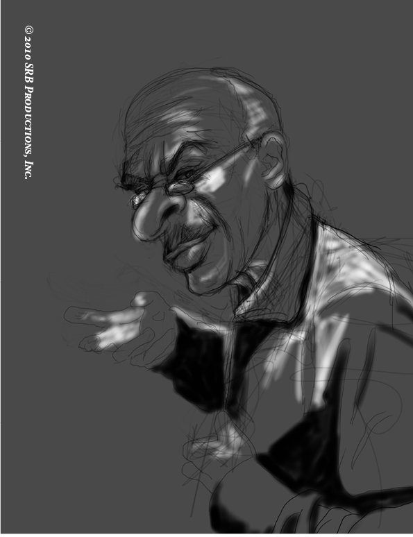
Stephen Bryant is one of the most talented people I have met. He inked the designed for one of my books, Animal Kingdom and it blew my socks off. If anyone needs the service of an artist, then he is your main. Check out what he has to say below.


Could you tell us what work you currently have available
?
Sure, some of the book covers that are currently available are Animal Kingdom, Alien Aberrations, Mal Contents, Drawn to Danger, Haftmann's Rule, and Darker Than Noir. For a full list you can check out my website as I have a hard time keeping track of the stuff that came out last year. Most of my work is available on amazon.com.

Tell us about your latest release.
Well my latest release is a design campaign for Jim Coleman Ltd., but no one here wants to read about that. They want action, horror, and suspense. So I will say my latest, and some say, greatest release is the cover for Animal Kingdom. It was a blast to do this cover and it was the first time I painted a full blown carnivorous gorilla. The biggest thing about this image was that I actually forgot the story took place in the UK. So mid final pencil I had to redo everything to place the steering wheel on the right side. Once I had the final pencil all set, the rest of the illustration just came together.

For someone unfamiliar with your work, how would you describe your illustrations?
Oh man, I have never been really good with this question. It is why my resume is such a mess. My style is actually all dependent on lighting. The balance between black and white is first and foremost instead of any particular paint style. Due to the fact that I am partially colorblind, I have to make sure the my under painting is spot on, so then I can just add some predetermined colors and ta da!

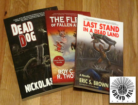
What else do you have in the pipeline? At the moment I am working on a bad ass fairy tale book, which is all I can say about that. I also started work on a graphic novel title Traumatized. This will display my new pen and ink styling. Soon to be released is Dead Dog which is just such an awesome cover for Gran Mal Press. I went up and down with this illustration fighting it the whole time…it also didn’t help that I was in a cast.

What artists have had the most influence on your own artwork?
This is one of those questions that makes you have all kinds of flashbacks. If I had to pick some of my favorites, they would be (in no particular order) Tim Bradstreet, Alex Ross, Richard Krzyka, Jim Lee, Julie Bell, and probably Tom Herzberg my teacher. Tom showed me not only how to paint but also how to break an image down. How does something work, why does it work that way, and finally who is the image for? Allot of artist forget that. It really cool to be able to create a dramatic, ass kicking scene of Spider Man beating up Catwoman, but if the client asked for two mobster fist fighting and you draw superheroes…you got problems.

What was the last thing you read?

I actually just finished reading I Am Legend by Richard Matheson. I am a huge Matheson fan and whenever I need a little inspiration I sit and read one of his short stories from Button, Button: Uncanny Stories.

Anything else you’d like to tell us about?

Yeah I would like to make a statement to all aspiring artists...stick with it. There is a quote from Tim Bradstreet that has been running thru my head the last couple of months “If you don’t have the passion . . . that drive and determination, then do yourself a favor and go back to college. Get a degree and then call me, you can help me with my taxes.” Bottom line you have to keep pushing, keep challenging yourself. No one every got anything they truly wanted the easy way, and for those that did, it was a hollow victory.

For the full story, please visit Iain's blog at; http://iainrobwright.blogspot.co.uk/2012/03/interview-with-stephen-bryant.html

Sunday, June 19, 2011

Darker than Noir Cover

06/19/2011

Howdy all!! Long time no see. I decided to write a quick blog post pertaining to how the book cover for Grand Mal Press' upcoming novella "Darker than Noir" was created. The book is not set to be released anytime soon; however a preview, featuring the cover, is available to the public. As promised to a couple of fans, here is my process for creating the illustration. First off let me start by saying that this piece was created using Corel Painter XI, using a Cintiq 21 WX Tablet, and took a total of 22 hours.


In the first image we have the composition drawn using a pen and then scanned. Once the image was loaded, I was having a hard time determining how the face of the detective should look, so I shaded in an overall tone to help my painting which was also done on the hand. Since it is digital, drawing on the sketch does not hinder the painting, as we can just delete that layer once it no longer has a purpose. Now we can move on to the painting!!


Due to my eyesight, I start all my paintings in Black & White. I lay in my pure blacks, which has become something I love in illustrations. A sense of contrast between the pure black and white has sort of become of my thing. I know that many say there are no pure blacks and whites in the real world. I really dont care, it looks slick.

Once most of my tones are in place I start to work on the details, focusing on the shirt, glass, pistol, and the shades in the background. I still have not spent a tone of time blending or anything, just big simple blocks of tone.


After about 10 hours we have the final black and white version of the painting. The edges have been cleaned, horizontal slices have been added to give a classic noir feel, and we ghouled up the female character. I originally painted her as a clean upstanding woman who was supposed to consol our detective. Once it was in place it threw off the concept, so I gave her some scars. Originally there were mere drying mascara tracks, however it turned into skin peeling off and cracking. Allowing for teeth to be shown in their full glory.


Now that the Black and White painting is in place and everything looks tight, we went ahead and placed some color over the top just to get a sense of the color direction. I always have an idea in my head of what the final image will look like, but you can always surprise yourself with a color that you never thought would work.


After hours of laying colors and blending the blocked tones with a custom natural brush to give a slightly more realistic look, we have our final painted illustration. I hope you enjoyed this post and if you would like more details on the process, let me know. I will be sure to go into more detail on the next post!!


If you would like ask Stephen a question, contact him at: stephenbryant@srbproductions.net

Monday, April 11, 2011

How did you break into the comic book industry?

04/11/2011

How did you break into the comic book industry?

I received this question a couple of weeks ago and had to stop, sit back, and actually ponder regarding how I was capable to compose a carbon footprint on the comic vine.

It all started in senior year of art school. One afternoon, I was working on a project in the corner of the area with my headset on, as customary, trying to acquire as much quality as one could into a painting until the deadline, when one of my friends and fantastic artist Jen Brazas approached me. Tapping my shoulder and point at her recent comic purchase, she wanted to tell me, “Your style really looks like this guys. Do you do comic stuff?”

This hit like a sack of potatoes, I have never done anything directly connected to comics, in fact, till this second of time my main focus for art was going to be en route for magazines and newspapers. Curious, I went around asking people if they believed my style could transfer over toward comic books. The masses responded with a resounding yes!

Well, now comes the tricky part, getting my foot in the door. Not knowing what to do first, I contacted Douglas Klabua, who I had met previously at an event I volunteered for. I asked Doug if we could setup an interview. This was the turning point in my quest, as one day Doug would allow me to have my biggest break.

We discussed everything and anything from digital vs. traditional, time constraints, contracts, and comic styles. This was nothing but sensational, as he gave me so much vital information and a general idea of what a freelance comic illustrator must do to be profitable. He also mentioned that I should attend Comic Con that year.

It was a big investment for a college kid to partake in but I was able to scrounge up enough for a half table and a couple of prints. In order to draw some more attention, a painting was created to have something relevant to the show and the comic community. I painted a Watchman inspired image. It was a huge hit, selling out of prints the first day.

While there I was able to walk around and introduce myself to people, and as I was talking to someone who should stop by and see me, no other than Douglas Klabua. He was checking out the show and was to see myself take the initiative toward the convention. Doug took me around and introduced me to some of his friends and art directors. One being Joe Gentile, Art Director of Moonstone Publishing.

Joe loved my stuff and asked if I was interested in doing cover work sometime. Of course I said yes and the rest was history. So, how did I break into the comic industry? Networking and Exposure. It is simple thing but, in this impersonal world, sometimes a little face to face time can do wonders.

If you would like ask Stephen a question, contact him at: stephenbryant@srbproductions.net

Sunday, October 24, 2010

The Painter XI Experiment Continues!

Displayed is Black and White character study. I wanted to create something for the kiddies. Well... that was the original idea and then things went another way. Enjoy!

I started out with a loose pen sketch.


After scanning and setting up for a digital painting, I added a dark tone to the image and then placed my darkest darks and some of the initial highlights.


The next stages, I pushed the values and started to put in various small fine points.


After working on the character for an hour, I decided to push the creep factor and add a teddy bear to the mix.


Next I lowered the eyebrows and lower the shoulder of the character to try to make the characters seem age and tired. Also, a cane has been added. This will remain hazy as I do not want it to draw to much attention.


Next, the fun stuff began I added details. The hair is cleaned up and brought into focus, as well as lighting detail added to the teddy bear just to convey some fur texture.


I will update the blog as I continue to add to the Corel Painter Experiment. Stay posted to see all the updates and check out the rest of my work at srbproductions.net

If you would like ask Stephen a question, contact him at: stephenbryant@srbproductions.net